Wednesday, March 26, 2014

Big White


Big White. goauche on paper. 7.5 x 8.5" 2013

Although it is samll in size, this little gouache packs a big punch idea-wise. Several interesting pictorial cues are at work here; the orange line bisecting the big white shape becomes a "tree" or 3D form at the bottom, casting a shadow back onto the white. The white is simply the white of the page. So the white shape seems  to be setting back far enough for the shadow to function. The tinted version of the orange and green occur in the painting, but they confuse any spatial reading. On the right it seems to receed into space, yet at the top they advance. The bright orange line surafces in 3 places, each changing the reading of the image. 
Originally, this was half of a larger painting. Cropping can be such a versatile tool.

Sunday, September 22, 2013

figure ground


This painting is titled Green Formula. The sky area is bright greenish-yellow, while the green shapes at the bottom are a shade of lime green. I want to investigate this piece more.  As I am painting these, my primary concern is figure-ground relationships and activating the space through color. The largest shape, dark green and rectangular, suggests that the lime-green shapes at the bottom are holes. This is done by careful attention to value, and the greenish color wanting to link up with the yellow background. But the green shapes also  feel as though they are in front of the rectangle.There's also the ambiguous gray shape at the top right…does it go behind the rectangle? It certainly appears to. The single red hue is a tomato-red, and it's a very powerful force. I like mystery in Art. 


Monday, June 24, 2013

Artistic freedom

Juan Miro. Dutch Interior I. 1928.
So this is what Miro did with The Lute Player (17th century); parts of the original painting survive.The dog is still there; and the architectural square at the bottom, the post and ball finial at the left. The white tablecloth is very prominent, but where is the woman listening? I'm still looking for her. This was amazing to me; both that he was inspired by this piece and that he worked off of this image.What I love here is the color.


The Lute Player by Henrick Martensz Sorgh.

Thursday, October 7, 2010

Walking with Big Shoes


Keep on Truckin' by Robert Crumb

Mom walking in her big shoes. Max Witter, 6 years old.


I've always been amazed by children's art and inspired by my own kids' pictures. This painting above, right, was inspired by a drawing my son did of a figure in the same pose (above). Later someone pointed out that it resembled that iconic figure by Robert Crumb, from Zap Comix; 1967. I remember some great images from Mad magazine in the 70's but was too young for Zap. The unusual pose is what struck me about this; walking with the arms behind the head. It's odd to see the arms in a relaxed state while the lower body is moving. My son said it was a portrait of me "walking with my big shoes". My shoes were too big that year, from  swollen feet during my pregnancy with Jack. In the painting I wanted to express a feeling of pure happiness. But I included a wasp under the leading foot; signifying the comic/tragic nature of life. That's our old house up there, overlooking the Missouri river.

Sunday, October 3, 2010

Abstract paintings byJennifer Wiggs: What is a "bad" abstract painting?

Abstract paintings byJennifer Wiggs: What is a "bad" abstract painting?: "Yellow Green landscape. So the complement of red-violet is?...Yep, green-yellow. Here I did an ink drawing on watercolor paper, followed ..."

What is a "bad" abstract painting?

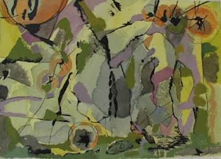
Yellow Green landscape.
So the complement of red-violet is?...Yep, green-yellow. Here I did an ink drawing on watercolor paper, followed by the yellow watercolor,ending with the opaque gouache on top. So what is it? The subject I mean? Well, it's a painting. How do you define a painting? An arrangement of colors, lines and values on a flat surface. I thought of this as a landscape, re-arranged, a slightly fragmented surface. The blue grays complement the orange touches. How can you tell what is "bad" abstract painting? This is a very intriguing and difficult question. I've seen warehouses full of really bad abstract pieces online; usually characterized by bright color, repetitive, monotonous mark-making, mark-making that isn't sensitive to the page or descriptive in any way, is not  sensitively made, like beautiful calligraphy can be. Frequently they are huge pieces, with out of the tube colors. Or they are obviously look-alikes to someone elses' real, heartfelt art. Sometimes they are so loud the echo hurts; they are screaming look at me!!

Thursday, September 30, 2010

Abstract paintings byJennifer Wiggs: Color as Subject

Abstract paintings byJennifer Wiggs: Color as Subject: Blue and Orange Beat. gouache on paper. 9x 13". Color is my subject in this painting.The brightest red behaves more like an orange here; t..."