
Sunday, June 8, 2014

Tuesday, May 6, 2014
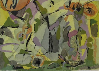
Naples Yellow. gouache on paper 9 x 13".

My process here is to paint it as I go. I mixed up a few colors, but finding the shapes and shape relationships is done intutively. I like using colors close in value, like the purple and the gray, because you get an interesting and soft spatial change.
I like the big, sweeping purple areas. They come from lines but end up reaching themselves into shapes or areas. There are several areas or groups of color arrangements I really like. Especially the bottom right corner. It does seem like a face. The color Naples Yellow is mixed into all the colors seen here. It's a soft, beige-type yellow.The painting has indistinct spatial areas; it seems to have some spatial structure, although it is vague. It does have smaller forms at the top which lend a feeling of recceding objects. Lastly, the Naples Yellow is drybrushed over some larger shapes, which imply a texture. On the left you see a circlular form which I liked so much I've done 3 or 4 paintings that feature it, Here's one: Aperture, shown below:

I think there are more motifs in the first painting I could use to start another!
Wednesday, March 26, 2014
Big White

Although it is samll in size, this little gouache packs a big punch idea-wise. Several interesting pictorial cues are at work here; the orange line bisecting the big white shape becomes a "tree" or 3D form at the bottom, casting a shadow back onto the white. The white is simply the white of the page. So the white shape seems to be setting back far enough for the shadow to function. The tinted version of the orange and green occur in the painting, but they confuse any spatial reading. On the right it seems to receed into space, yet at the top they advance. The bright orange line surafces in 3 places, each changing the reading of the image.
Originally, this was half of a larger painting. Cropping can be such a versatile tool.
Sunday, September 22, 2013
figure ground

This painting is titled Green Formula. The sky area is bright greenish-yellow, while the green shapes at the bottom are a shade of lime green. I want to investigate this piece more. As I am painting these, my primary concern is figure-ground relationships and activating the space through color. The largest shape, dark green and rectangular, suggests that the lime-green shapes at the bottom are holes. This is done by careful attention to value, and the greenish color wanting to link up with the yellow background. But the green shapes also feel as though they are in front of the rectangle.There's also the ambiguous gray shape at the top right…does it go behind the rectangle? It certainly appears to. The single red hue is a tomato-red, and it's a very powerful force. I like mystery in Art.
Monday, June 24, 2013
Artistic freedom
 |
| Juan Miro. Dutch Interior I. 1928. |

 |
| The Lute Player by Henrick Martensz Sorgh. |

Thursday, October 7, 2010
Walking with Big Shoes

 |
| Keep on Truckin' by Robert Crumb |
 |
| Mom walking in her big shoes. Max Witter, 6 years old. |

Sunday, October 3, 2010
Abstract paintings byJennifer Wiggs: What is a "bad" abstract painting?
Abstract paintings byJennifer Wiggs: What is a "bad" abstract painting?: "Yellow Green landscape. So the complement of red-violet is?...Yep, green-yellow. Here I did an ink drawing on watercolor paper, followed ..."
What is a "bad" abstract painting?
 |
| Yellow Green landscape. |

Thursday, September 30, 2010
Abstract paintings byJennifer Wiggs: Color as Subject
Abstract paintings byJennifer Wiggs: Color as Subject: Blue and Orange Beat. gouache on paper. 9x 13". Color is my subject in this painting.The brightest red behaves more like an orange here; t..."
Color as Subject
 |
| Blue and Orange Beat. gouache on paper. 9x 13". |

Wednesday, September 22, 2010
Abstract paintings byJennifer Wiggs: Color Planes
Abstract paintings byJennifer Wiggs: Color Planes: "Color Planes. 13 x18. gouache. c2010Here's a piece demonstrating how one color can play different spatial roles in a composition. Careful ..."
Color Planes
 | |
| Color Planes. 13 x18. gouache. c2010 | Here's a piece demonstrating how one color can play different spatial roles in a composition. Careful arrangements can increase visual play. The gray and the orange can be both figure and ground. I also use implied lines at the top where the orange creates a diagonal from the left, the small arrangement of shapes in the top right makes the orange appear like it's occupying two different spaces. A bonus by using gray: no matter what color you select next to a gray, the gray will take on that color's complement. In this case, the gray becomes bluish. |
Thursday, September 16, 2010
Abstract Shapes
 | ||||
| Night Moon. Paper college. 9 x 11". | I like to find "unexpected" shapes by working with paper. The contrast between torn/cut edges can offer much to an image. When I think about shapes I always think of Paul Klee's statement that shape is the great enigma of painting. It is very difficult to invent shapes that are both specific (without being a thing) and open enough to leave the door open for the viewer's interpretation. This is a problem, and I l-o-v-e problems. For me, to be an artist is to be involved with problems. It's my passion to be working with difficult ideas. I like to be in a place where the unforeseen conclusion accompanies my efforts. I frequently do collage as part of my creative process; sometimes they are totally abstract, sometimes not. |
Saturday, September 4, 2010
Abstract paintings byJennifer Wiggs: Methods of composing
Abstract paintings byJennifer Wiggs: Methods of composing: Pond's Edge. Gouache.12 x16". This small abstract (mostly) painting is full of other paintings. Choose any corner or area, and you can c...
Methods of composing
 | |||
| Pond's Edge. Gouache.12 x16". | This small abstract (mostly) painting is full of other paintings. Choose any corner or area, and you can crop it until you find a suitable or interesting motif. This is where I go to "mine" for my next painting.This piece is one of a series of loose abstract pieces I've done that hover on the edge of figuration. This painting has the graphic elements I like; the letter forms. This piece is made intuitively, with no plan. The color palette is what really keeps me looking at it; the rich golds and reds. Basically it's a red-green combination, and because these are complements, they will always give you good contrast. |
Thursday, August 26, 2010
The Visual Elements: Edge Awareness
 |
| The Fox and the Crow by Antonio Frasconi |
Saturday, August 14, 2010
The Visual Elements

Tuesday, August 10, 2010
Methods of composing
 |
| North Face by Jennifer Wiggs. gouache on paper, 17x20".c2010 |
 |
| Dutch Interior by Joan Miro |
Friday, August 6, 2010
red command
 |
| Red Command, gouache, 10 x14". c2009 |
 |
| Paul Nash |
Subscribe to:
Posts (Atom)