Thursday, October 7, 2010

Walking with Big Shoes


Keep on Truckin' by Robert Crumb

Mom walking in her big shoes. Max Witter, 6 years old.


I've always been amazed by children's art and inspired by my own kids' pictures. This painting above, right, was inspired by a drawing my son did of a figure in the same pose (above). Later someone pointed out that it resembled that iconic figure by Robert Crumb, from Zap Comix; 1967. I remember some great images from Mad magazine in the 70's but was too young for Zap. The unusual pose is what struck me about this; walking with the arms behind the head. It's odd to see the arms in a relaxed state while the lower body is moving. My son said it was a portrait of me "walking with my big shoes". My shoes were too big that year, from  swollen feet during my pregnancy with Jack. In the painting I wanted to express a feeling of pure happiness. But I included a wasp under the leading foot; signifying the comic/tragic nature of life. That's our old house up there, overlooking the Missouri river.

Sunday, October 3, 2010

Abstract paintings byJennifer Wiggs: What is a "bad" abstract painting?

Abstract paintings byJennifer Wiggs: What is a "bad" abstract painting?: "Yellow Green landscape. So the complement of red-violet is?...Yep, green-yellow. Here I did an ink drawing on watercolor paper, followed ..."

What is a "bad" abstract painting?

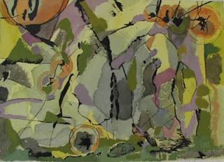
Yellow Green landscape.
So the complement of red-violet is?...Yep, green-yellow. Here I did an ink drawing on watercolor paper, followed by the yellow watercolor,ending with the opaque gouache on top. So what is it? The subject I mean? Well, it's a painting. How do you define a painting? An arrangement of colors, lines and values on a flat surface. I thought of this as a landscape, re-arranged, a slightly fragmented surface. The blue grays complement the orange touches. How can you tell what is "bad" abstract painting? This is a very intriguing and difficult question. I've seen warehouses full of really bad abstract pieces online; usually characterized by bright color, repetitive, monotonous mark-making, mark-making that isn't sensitive to the page or descriptive in any way, is not  sensitively made, like beautiful calligraphy can be. Frequently they are huge pieces, with out of the tube colors. Or they are obviously look-alikes to someone elses' real, heartfelt art. Sometimes they are so loud the echo hurts; they are screaming look at me!!

Thursday, September 30, 2010

Abstract paintings byJennifer Wiggs: Color as Subject

Abstract paintings byJennifer Wiggs: Color as Subject: Blue and Orange Beat. gouache on paper. 9x 13". Color is my subject in this painting.The brightest red behaves more like an orange here; t..."

Color as Subject

Blue and Orange Beat. gouache on paper. 9x 13".
Color is my subject in this painting.The brightest red behaves more like an orange here; the blue is "pulling" the orange out of the red. Cadmium reds are really quite orange to begin with. The light/dark grays and other neutrals add a liveliness to the palette.My goal here was to pack it in and make it feel like it could fly apart or fall apart.. Do you think the surface is active enough? I think I could have gone further.

Wednesday, September 22, 2010

Abstract paintings byJennifer Wiggs: Color Planes

Abstract paintings byJennifer Wiggs: Color Planes: "Color Planes. 13 x18. gouache. c2010Here's a piece demonstrating how one color can play different spatial roles in a composition. Careful ..."

Color Planes

Color Planes. 13 x18. gouache. c2010Here's a piece demonstrating how one color can play different spatial roles in a composition. Careful arrangements can increase visual play.  The gray and the orange can be both figure and ground. I also use implied lines at the top where the orange creates a diagonal from  the left, the small arrangement of shapes in the top right makes the orange appear like it's occupying two different spaces. A bonus by using gray: no matter what color you select next to a gray, the gray will take on that color's complement. In this case, the gray becomes bluish.

Thursday, September 16, 2010

Abstract Shapes

Night Moon. Paper college. 9 x 11".  I like to find "unexpected" shapes by working with paper. The contrast between torn/cut edges can offer much to an image. When I think about shapes I always think of Paul Klee's statement that shape is the great enigma of painting. It is very difficult to invent shapes that are both specific (without being a thing) and open enough to leave the door open for the viewer's interpretation. This is a problem, and I l-o-v-e problems. For me, to be an artist is to be involved with problems. It's my passion to be working with difficult ideas. I like to be in a place where the unforeseen conclusion accompanies my efforts. I frequently do collage as part of my creative process; sometimes they are totally abstract, sometimes not.

Saturday, September 4, 2010

Abstract paintings byJennifer Wiggs: Methods of composing

Abstract paintings byJennifer Wiggs: Methods of composing: Pond's Edge. Gouache.12 x16". This small abstract (mostly) painting is full of other paintings. Choose any corner or area, and you can c...

Methods of composing

Pond's Edge. Gouache.12 x16".
This small abstract (mostly) painting is full of other paintings.  Choose any corner or area, and you can crop it until you find a suitable or interesting motif. This is where I go to "mine" for my next painting.This piece is one of a series of loose abstract pieces I've done that hover on the edge of figuration. This painting  has the graphic elements I like; the letter forms. This piece is made intuitively, with no plan. The color palette is what really keeps me looking at it; the rich golds and reds. Basically  it's a red-green combination, and because these are complements, they will  always  give you good contrast.

Thursday, August 26, 2010

The Visual Elements: Edge Awareness

The Fox and the Crow by Antonio Frasconi
It's wonderful to see the artist here responding to the edge of the format; especially the fox's legs. Rather than let the legs run off the page (poor design) he bends them to fit in the rectangle. Also notice how he does this with the tail, and uses the tail in the design as it links up visually with the line of the ear. Also see how he makes the negative spaces so alive, they are part of the energy of the whole piece.

Saturday, August 14, 2010

The Visual Elements

Try looking at a painting as only a series of choices. The visual elements are: line, shape, color, value,  and texture.When you think about it this way, it helps to highlight why and how the painting looks the way it does. Often in order to express something about color, an artist has to let go of line, or detail. In order to focus on shape, an artist may choose to avoid too much texture.  What the artist chooses is what you will see. Often a work reveals itself by what it is not.  For those wishing to improve their drawing skills, drop color entirely.

Tuesday, August 10, 2010

Methods of composing

North Face by Jennifer Wiggs.
gouache on paper, 17x20".c2010
Dutch Interior by Joan Miro
One method of achieving more interesting compositions is to cut a larger piece down; cut out the parts that are dull, too busy or just bad and then start with the fragment. A small area of a piece could be the start of your next painting or it could just BE the painting.This painting is from a series where 'white' (in this case the white of the page) is the central  focus. This is a fragment from the original, where half was cut out and pitched. We grow accustomed to norms of composing and I enjoy deliberately challenging those conventions.Using purple in a landscape is one way; moving horizon lines around is another. Do things the wrong way and see what happens.

Friday, August 6, 2010

red command

Red Command, gouache, 10 x14". c2009
Paul Nash
This painting has an element of mystery. It's from a series I'm working on about the color white. From working in watercolor I learned the practice of "saving the whites" and that has helped me. I'm creating and destroying the white simultaneously. I like the letter forms in a landscape format.This merging of abstract, intuitive elements and more visual elements can be seen in many artist's work, such as Paul Nash.