 |
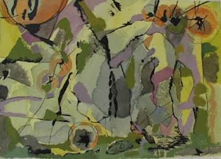
| Yellow Green landscape. |
So the complement of red-violet is?...Yep, green-yellow. Here I did an ink drawing on watercolor paper, followed by the yellow watercolor,ending with the opaque gouache on top. So what is it? The subject I mean? Well, it's a painting. How do you define a painting? An arrangement of colors, lines and values on a flat surface. I thought of this as a landscape, re-arranged, a slightly fragmented surface. The blue grays complement the orange touches. How can you tell what is "bad" abstract painting? This is a very intriguing and difficult question. I've seen warehouses full of really bad abstract pieces online; usually characterized by bright color, repetitive, monotonous mark-making, mark-making that isn't sensitive to the page or descriptive in any way, is not sensitively made, like beautiful calligraphy can be. Frequently they are huge pieces, with out of the tube colors. Or they are obviously look-alikes to someone elses' real, heartfelt art. Sometimes they are so loud the echo hurts; they are screaming
look at me!!


